Wednesday, April 29, 2009
Tuesday, April 28, 2009
fabric painting
Monday, April 27, 2009
roses inside
Saturday, April 25, 2009
wonky car
Friday, April 24, 2009
rubbing texture
Thursday, April 23, 2009
practicing brush technique
Tuesday, April 21, 2009
flat form
Monday, April 20, 2009
colorful wonkiness
Playing with paint on 2 different paper textures. The spiral is on thin, smooth journal paper. The other mug is on 140# Arches.
I'm constantly testing paint on various papers, just to experience the texture of drag and flow. I often like the results on cheap paper better, except for the ripple problem.
Sunday, April 19, 2009
partly en plein aire
Saturday, April 18, 2009
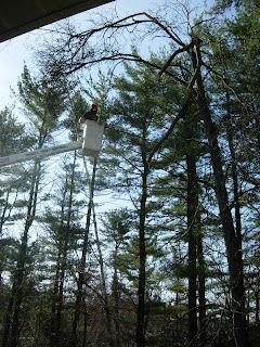
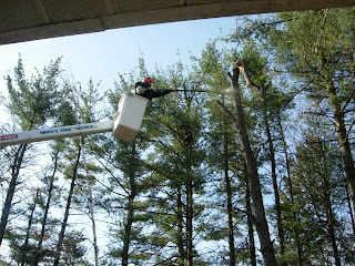
amazing tree guys
In the devastating ice storm last December, many trees in our yard were damaged or completely broken. One was a huge old hickory that lost more than 3/4 of its crown.
We were sad to have to take it down, but decided to do it before the hanging branches fell and killed someone.
We hired a local tree service and they did an amazing job. Bobby, the cutter here, reached out with a 15-foot pole saw, standing in the bucket at full extension, and still could barely reach the tree. I took these pictures from the second floor of our house.
Now the tree will help keep us warm next winter; we have a lot of long-burning hickory to split up for firewood.
Friday, April 17, 2009
finally, warm enough to paint outside!
Thursday, April 16, 2009
Wednesday, April 15, 2009
Monday, April 13, 2009
flat heads
Saturday, April 11, 2009
Friday, April 10, 2009
the epitome of sketchiness
Thursday, April 09, 2009
purple guy
Months ago I was trying out a drawing with a drybrush, copying from a photo of Christopher Walken.
Yesterday I discovered a lovely mix Winsor & Newton quinacridone violet plus cobalt blue. I needed somewhere to place this outstanding color.
Poor Christopher is enduring my victimization.
On 140# Arches.
Tuesday, April 07, 2009
filling a page
Monday, April 06, 2009
bell and drum
Saturday, April 04, 2009
new pencil
I love the feeling of this watersoluble graphite pencil by Prismacolor. It has the perfect amount of drag without too much pull, more than non-soluble graphite, less than a w/c pencil.
Though I didn't dissolve it this time, I like that the pencil offers that option. I resisted the lure to make the sky blue.
On 60# drawing paper.
Friday, April 03, 2009
profile practice
Wednesday, April 01, 2009
working from a master
Drawings by John Whalley are stunning. I saw one in the Portland (ME) art museum and then bought a book of his work.
Sketching hyperrealism--the ultimate in artistic oxymorons.
Doing a version of a master's work teaches me how they see detail that I'd never notice.
5B pencil on 60# sketchpaper. Paper and color are distorted by a water sketch on the reverse, plus my scanner's blueish contribution.
Subscribe to:
Posts (Atom)