
I've read that artists use gouache differently from w/c, but I used glazing and washes a bit here and the paint seemed pretty similar. Must be doing something wrong.
The opaqueness works well for daubing berber carpet, though.
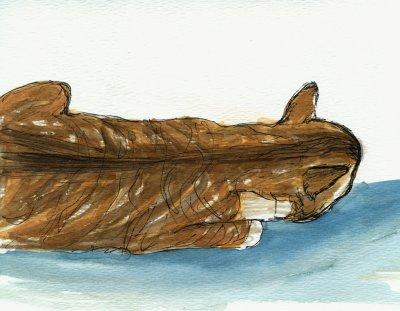
I'm not good at tiger stripes, so switched to orange and red cats. It's their inner fire showing.
3 comments:
the good thing about gouache is that it's opaque so you can correct 'mistakes' you made with aquarel.. it changes the character of the painting a little, makes it less soft but that's not a bad thing, depends on what you're looking for..
i love your cats, have been trying to 'do' mine again last night, promised myself i'll try every day untill i've got it... :)
Fabulous composition and color!
When I was a student (long, long ago before the advent of computers) I got the impression that most of us used gouache primarily to create flat, opaque areas of colour as in a poster design or in any other visuals of 'graphics'. Now of course the computer and graphics software is much better for producing that kind of thing so it's really whether you like the feel of it for your illustrations. Personally I hated finding those expensive tubes dried up into little solid lumps, so I prefer either the wateryness and transparency of watercolour or the versatility of acrylic.
I really like the effect you've achieved with the glass in the bottle above and the limited palette in the hand picture below is very effective.
Post a Comment